How to Make an Engaging Nutrition Poster
A great nutrition poster does one job: it stops someone in a hallway, cafeteria, or clinic waiting room and delivers a single healthy idea before they've even finished walking by. The good news is you don't need to be a designer to make one that works. You just need a clear message and a few simple principles — and this guide walks you through both.
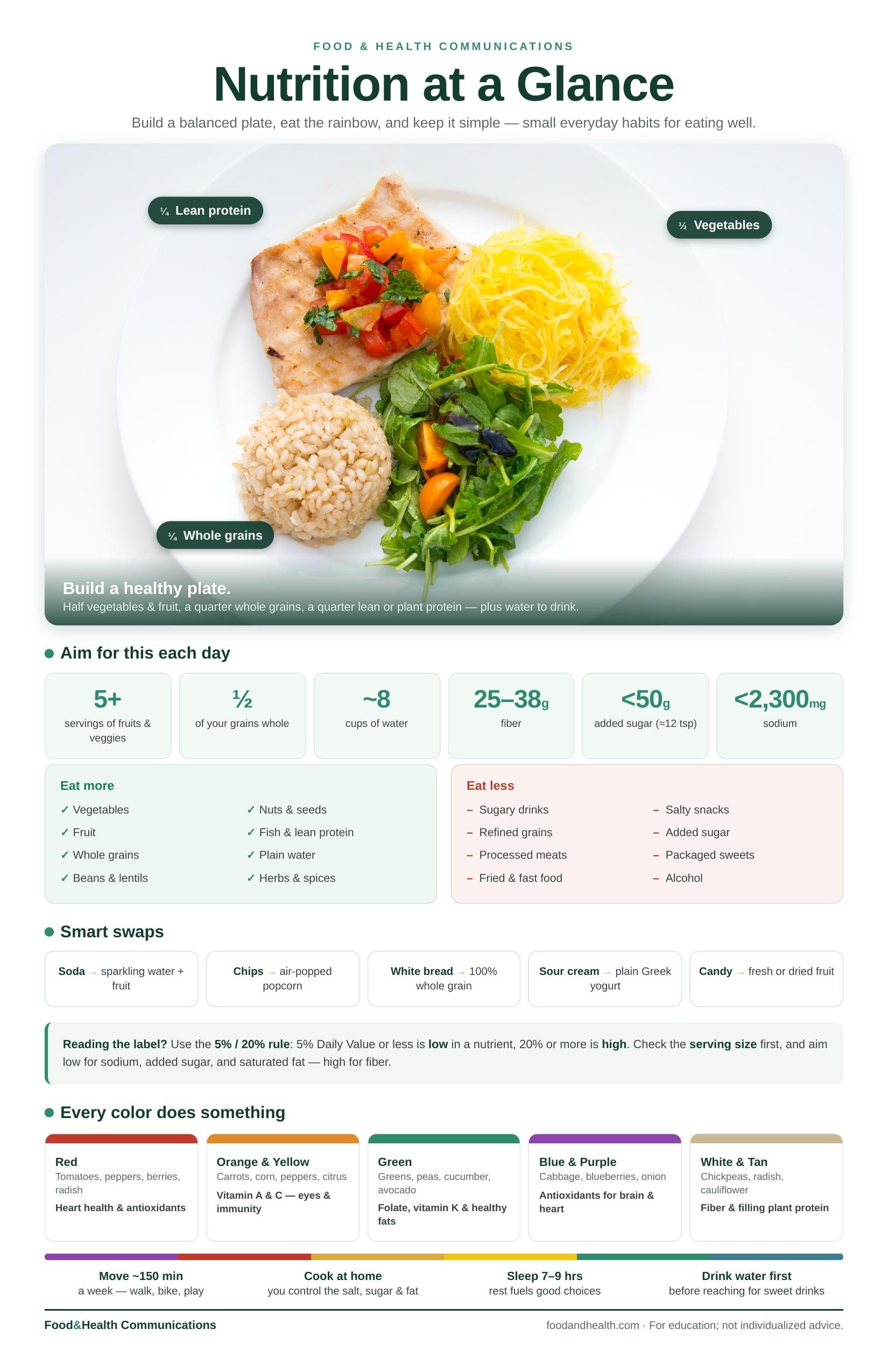
One page, one glance — what healthy eating actually looks like.
Healthy eating gets complicated fast — this poster makes it simple to see. It's built around a photo of a real balanced plate, with the model labeled right on the food: half your plate vegetables and fruit, a quarter whole grains, a quarter lean or plant protein, and water to drink. No diagrams to decode, just a picture of what a good plate looks like. Around it, everything that turns the idea into habits: the numbers to aim for each day (produce, fiber, water, added sugar, sodium), an eat-more / eat-less quick guide, five smart swaps, and the 5%/20% rule for reading a label.
An "every color does something" strip ties it all together — red, orange, green, purple, and white foods and what each one brings — so it doubles as an eat-the-rainbow reminder. Bright, positive, and evergreen (it works any month of the year), it's made to live somewhere people look: the fridge, a classroom wall, a clinic bulletin board, a break room, or a cafeteria. Download the print-ready 11×17 PDF and print as many as you like.
Format: Instant download · Print-ready 11×17 PDF (300-dpi photo) · For personal, classroom, and clinic use. Perfect for Nutrition Month - download and print
Start with one message
The most common mistake is trying to say everything. A poster is not a handout. Pick a single idea — "Eat the rainbow," "Drink more water," "Build a better plate" — and let everything on the poster serve that one message. If a viewer can walk away remembering one thing, your poster worked.
Pick a theme
Once you have your message, choose a theme to build it around:
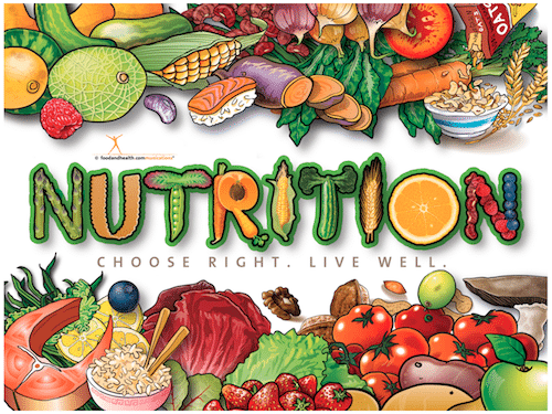
A keyword. Spell out a word like NUTRITION, FRESH, or HEALTHY using photos of colorful foods formed into letters. It's eye-catching and surprisingly easy.
A single nutrient. Feature all the foods rich in one nutrient — calcium, fiber, or potassium — with bright images and the amount each provides.
A cooking sequence. Show a dish coming together: whole vegetables, sliced, mixed, and the finished plate. People love seeing the "before and after."
An event or month. March is National Nutrition Month, and a themed poster is a perfect fit. Cut the event's wording from a printout and surround it with photos of your team.
Physical activity. The same tricks work for movement — arrange photos of running shoes, weights, and water bottles to spell BE ACTIVE!
Five design tips that make a poster pop
You don't need fancy software — just these fundamentals:
Big, bright images. One large, high-quality food photo beats ten small ones. Magazine ads, free stock sites, and your own phone camera are all great sources.
High contrast. Dark text on a light background (or the reverse) so it reads from across the room.
One or two fonts, max. More than that looks busy. Pick one bold font for the headline and one simple font for details.
Lots of white space. Crowding kills a poster. Give your message room to breathe.
End with a call to action. "Try one new vegetable this week." "Fill half your plate." Tell the viewer what to do.
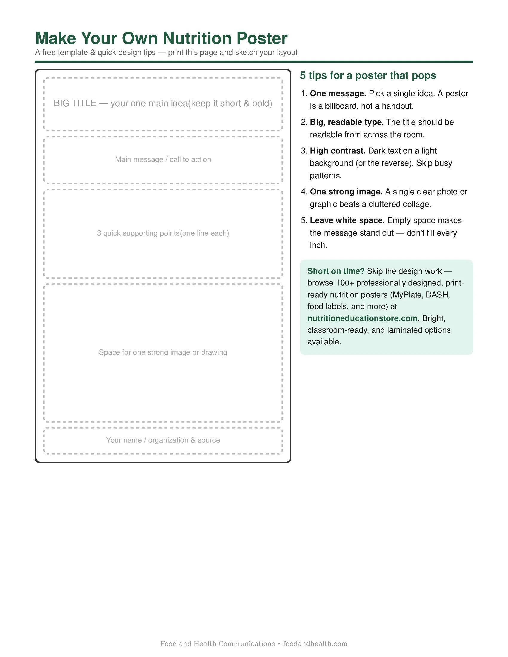
Download this free template PDF and make your own poster
One page, one glance — what healthy eating actually looks like.
Healthy eating gets complicated fast — this poster makes it simple to see. It's built around a photo of a real balanced plate, with the model labeled right on the food: half your plate vegetables and fruit, a quarter whole grains, a quarter lean or plant protein, and water to drink. No diagrams to decode, just a picture of what a good plate looks like. Around it, everything that turns the idea into habits: the numbers to aim for each day (produce, fiber, water, added sugar, sodium), an eat-more / eat-less quick guide, five smart swaps, and the 5%/20% rule for reading a label.
An "every color does something" strip ties it all together — red, orange, green, purple, and white foods and what each one brings — so it doubles as an eat-the-rainbow reminder. Bright, positive, and evergreen (it works any month of the year), it's made to live somewhere people look: the fridge, a classroom wall, a clinic bulletin board, a break room, or a cafeteria. Download the print-ready 11×17 PDF and print as many as you like.
Format: Instant download · Print-ready 11×17 PDF (300-dpi photo) · For personal, classroom, and clinic use. Perfect for Nutrition Month - download and print
Free and easy tools to design it
Your phone. A sketch or collage app lets you arrange photos into words or scenes right in your hand.
Canva or your computer. Free design tools have poster templates you can drop photos and text into — no design degree required.
The classic collage. Physical cutouts, glue, and a poster board still work beautifully, especially for a class project or a display made with your students.
Short on time? Start with a ready-made poster
Making your own is fun and rewarding — but if you need something polished on the wall this week, you don't have to start from scratch. Our studio designs high-impact, laminated nutrition posters on every topic — fruits and veggies, hydration, portion control, Nutrition Month, and more — all built on current nutrition science.
Best-Selling Nutrition Posters
Bright, professionally designed posters for classrooms, clinics, cafeterias, and health fairs.
You can also browse our full library of free printable nutrition handouts to pair with your poster — charts and worksheets you can print and hand out at the same display.
So, how do you make an excellent nutrition poster?
One message, a strong theme, big images, and a clear call to action. Whether you design it yourself or start with one of ours, now you know exactly what makes a poster people actually stop and read.
Nutrition Education Store
Look What's New in Our Store